

Great businesses are founded on great data. But with so many insights available how do you handle it effectively?
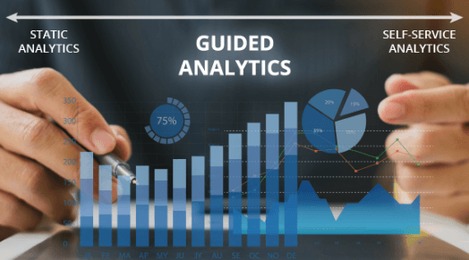
At one end of the analytics spectrum, we have “static analytics” which consists of reports as fixed dashboards, presentations, pdfs, or images. This is the traditional way of displaying data where data is aggregated and then shared with internal stakeholders. The end users have to depend on the analyst who developed the report or dashboard in order to derive insights or answer specific questions from the data. However, this is long and super tiring process.
Then we have “self-service analytics” on the other end of the spectrum, which enables users to directly interact with data from its source and even create dashboards and derive insights on their own without having to depend on an analyst. Using a feature like “Explain Data” in Tableau Desktop or a natural language processing feature like “Ask Data” in Tableau Server are examples of self-service analytics.
Lastly, “Guided Analytics” in between static analytics and self-service analytics. Using the guided analytics approach, an analyst is still in charge of creating a dashboard, but the end users are empowered to quickly understand the information and functionality of the dashboard and leverage various options to slice and dice data through the interactivity layers made available in it. The dashboards are informative, user-friendly, and display better performance. Ultimately, the guided analytics is way of providing solutions or creating dashboards by keeping the end users in mind.
Why Guided Analytics?
To understand the importance of guided analytics, let us consider two key components, user experience and performance.
Creating a successful user experience is imperative for guided analytics, without it, adoption rates will be low. Dashboards should be created keeping end user in mind. They should be simple, flexible and intuitive, empowering the end user to interact with the dashboards easily.
Guided analytic dashboards when designed should consist of a clean, simple design and responsiveness. A dashboard becomes unattractive the longer time a user has to wait for the data to load and slow speeds when interacting with the data. To ensure you create a high-performance dashboard for guided analytics, make sure you limit the number of filters, target specific fields, use action filters instead of quick filters, and high responsiveness to user interactivity.
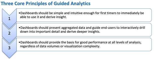
Core Principles of Guided Analytics
Designing Dashboards for Guided Analytics
Use this checklist to design user-friendly dashboards:
- Include an icon at the top left that tells about the purpose, summary, and parts or components of the dashboard.
- Use an appropriate title for dashboard that is dynamic (capable of reflecting the filtered or selected data) so that users are always able to see the context of what they are looking at..
- Minimize the number of colors used as too many can confuse end users. Best practice is to use 7 or less in a dashboard.
- Leverage tooltips to its fullest by including additional and relevant information by customizing tooltips and adding in sheets with additional information.
- Use system compatible fonts.
- Use action filters to drilldown to other charts that are not part of your dashboard itself.
Ready to get started? Get started in your analytic approach journey, and one of our analytics experts will consult with your company about where you want to go with your data.
Recent Blogs

What Retail Media Can Learn from Instacart’s AI Strategy
June 24, 2025

Beyond Chatbots: How Agentic AI Is Automating High-Stakes Business Decisions
June 11, 2025

From Batch to Real-Time: The Future of Data Distribution Using Databricks Delta Sharing
June 4, 2025

Accelerating Databricks Serverless Adoption with Agentic AI & Proven Practices
May 29, 2025