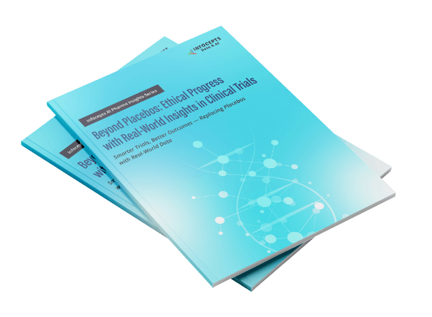
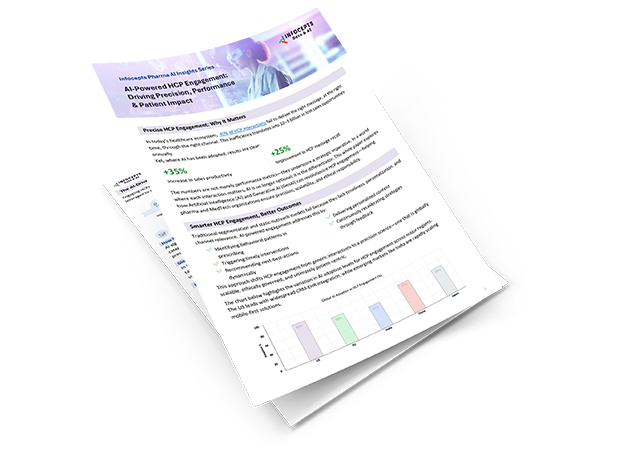
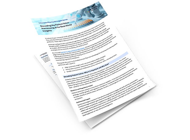
Get Your Guide

In this guide, you will learn:
- Choosing the right chart types to match your data and message
- Best practices to design clear, accurate, and engaging visuals
- Tools, templates, and resources to streamline your visualization process
Want to make your data easier to understand—and act on?
Download our guide, “How to Choose the Right Visuals for Your Data Story,” to learn how to turn raw data into meaningful visuals that engage your audience and support better decisions.
What you’ll learn:
- Types of Visuals – Understand when to use bar charts, line graphs, pie charts, heat maps, and more
- Design Best Practices – Create visuals that are clear, accurate, and easy to interpret
- Common Mistakes – Avoid misleading or cluttered charts that confuse instead of clarify
- Visualization Tools – Learn how to design for platforms like Tableau, Power BI, and D3.js
- Templates & Resources – Access helpful libraries, examples, and communities to improve your skills
Who Should Read This Guide?
Perfect for analysts, business leaders, marketers, and anyone who presents data regularly. This guide will help you:
- Simplify complex data
- Communicate insights clearly
- Engage and persuade your audience
- Make faster, data-driven decisions
- Build credibility through accurate representation
Whether you’re crafting a presentation, dashboard, or report, this guide gives you the tools to choose visuals that tell the right story.
Download your copy now and start turning data into action.
You might also like


